
Monday, November 30, 2020
Thursday, November 26, 2020

Tuesday, November 24, 2020
4 Seasons with Quietfire Design

Hello Quietfire fans! I today I'm bringing you a beautiful winter card using a
die from
Let me show you how I made my card. I started by gathering my materials. Most times I like to have my papers already chosen and go from there.

These dies are so perfect for the seasons! I chose this beautiful blue snowflake paper
from Paperwishes.com. It was perfect!
I made my card base first. I took white card stock and cut it to 8 1/2" x 5 1/2" and
scored it in the middle. I cut my blue pearlized card stock to 3 3/4" x 5 1/2" and
adhered it to the base. I cut my snowflake paper to 3 1/2" x 5 1/2" and adhered that
on top.

Next I took the "Winter" die and cut it from white card stock 3 times.

I then adhered them on top of each other using liquid adhesive.

I had cut the snowflake pattern paper so that the star was in the upper left corner
and would really set off the die cut. I adhered the die cut onto the card...again with
liquid adhesive. Then added some white pearls to the centers of the some of the
snowflakes and used a shimmer pen to the centers of the stars.
And that completed my card!

This is a great card sketch to showcase a die cut and by changing out the
papers and the die, the possibilities are endless!
Find this die and many other Quietfire Design dies and stamps at
And right now there is a sale on many of these items!
Thanks so much for stopping by today!
Betsy
Sadly, this is my last post on the Quietfire Creations Blog. Sometimes our
lives take us to places where there isn't as much time for serious crafting!
Sunday, November 22, 2020
Gratitude with Rachel Vass Designs

Hello everyone! Today I'm sharing another card made with the
November Release from:
This is another beautiful floral design in Rachel's shop!
To begin, I composed my card in the computer and printed it out onto
Neenah 80lb. Classic Crest Solar White card stock.

I colored my image with Copic markers.

I used a 4 color blend on the flowers and the leaves.

Copic colors used:
Leaves: YG11, G82, G94, G99
Flowers: Y02, Y15, Y35, Y38
I trimmed my panel to 4" x 5 1/4" and ink blended the sides with Antique Linen
Distress Ink. Then I mounted it onto a top folding A2 size green card base.
I added a 3mm green squid to the middle of each flower and then added a tiny
yellow sequin in the middle.
And that completed my card!

I hope you enjoyed today's tutorial. A beautiful card does not have to be
complicated to make!
If you haven't yet taken advantage - you still have time to purchase a
beautiful digistamp in Rachel's shop! Her sale is still on today!

Thanks so much for stopping by! I appreciate your time and interest!
Betsy
In my capacity as a design team member for Rachel Vass Designs, I do receive the products I use from them.
All opinions and creative decisions remain my own, and I only work with companies/use products that I love.
Wednesday, November 18, 2020

Monday, November 16, 2020
Stamp of the Month with Brutus Monroe

Hello everyone! Today I'm sharing the new
It's so adorable! This image would also work well for a Get Well card, too.
First I laid out my supplies.

I prepared my base first. For my A2 size card base I used Whitewash card
stock. This went really well with the patterned paper. I used a piece of
embossed dotted green paper for the next layer. I cut this to
4 1/8" x 5 3/8". I made a separate panel for my center. My patterned
paper, from the Paper Hearts paper pack, measures 2" x 4 1/2". I used a
scrap of Whitewash card stock 1 1/8" x 4 1/2" leaving a bit of room for
adhering to the patterned piece.

With a decorative edge die I die cut a piece for the seam that matches the
yellow hearts in the patterned paper.
Next I stamped my image.

Again, I used the Whitewash card stock for a base. I had decided to used
Prismacolor Pencils and this card stock is perfect for that!
I chose my colors as I went along. I started with light layers.


I completed each color section before moving on to another.

I was swatching each color group onto a scrap of the Whitewash card stock and
making sure it matched the patterned paper before actually coloring.
Prismacolor Pencils used:
Green: 905, 992, 105, 901, 920, 1006
Yellow: 916, 917, 1011, 1002
Pink: 928, 926, 1031
Brown: 943, 945, 1030, 937

At this point I was undecided if I wanted to use Gamsol on the pencil work. I really
couldn't make up my mind. I fussy cut the image leaving 1/8" edge around it...super
easy to cut out! I stamped my sentiment onto the center piece using Simon Hurley
Tropical Tango ink...it was a perfect match! I adhered my bear with foam tape to give the
card a bit more dimension. I added some Glossy Accents to 3 of
the pink hearts in the background and to the nose and eye of the bear. Then I put
a couple of dots of Nuvo Jewel Drops in Aqua Plains. My card was done, but
I did decide to use Gamsol on the coloring...I was much happier with how it looked!

I hope you enjoyed today's project! I love how it turned out!
This project uses the Stamp of the Month which is a subscription product!
There are many more products that you can get by subscription!
Go to BrutusMonroe.com and check out all of their wonderful
products! There's an awesome sale going on as well!
Thank you so much for stopping by and spending time here at my blog!
Betsy
In my capacity as a design team member for Brutus Monroe, I do receive the products I use from them.
All opinions and creative decisions remain my own, and I only work with companies/use products that I love.
Wednesday, November 11, 2020
In Love Rose with Rachel Vass Designs
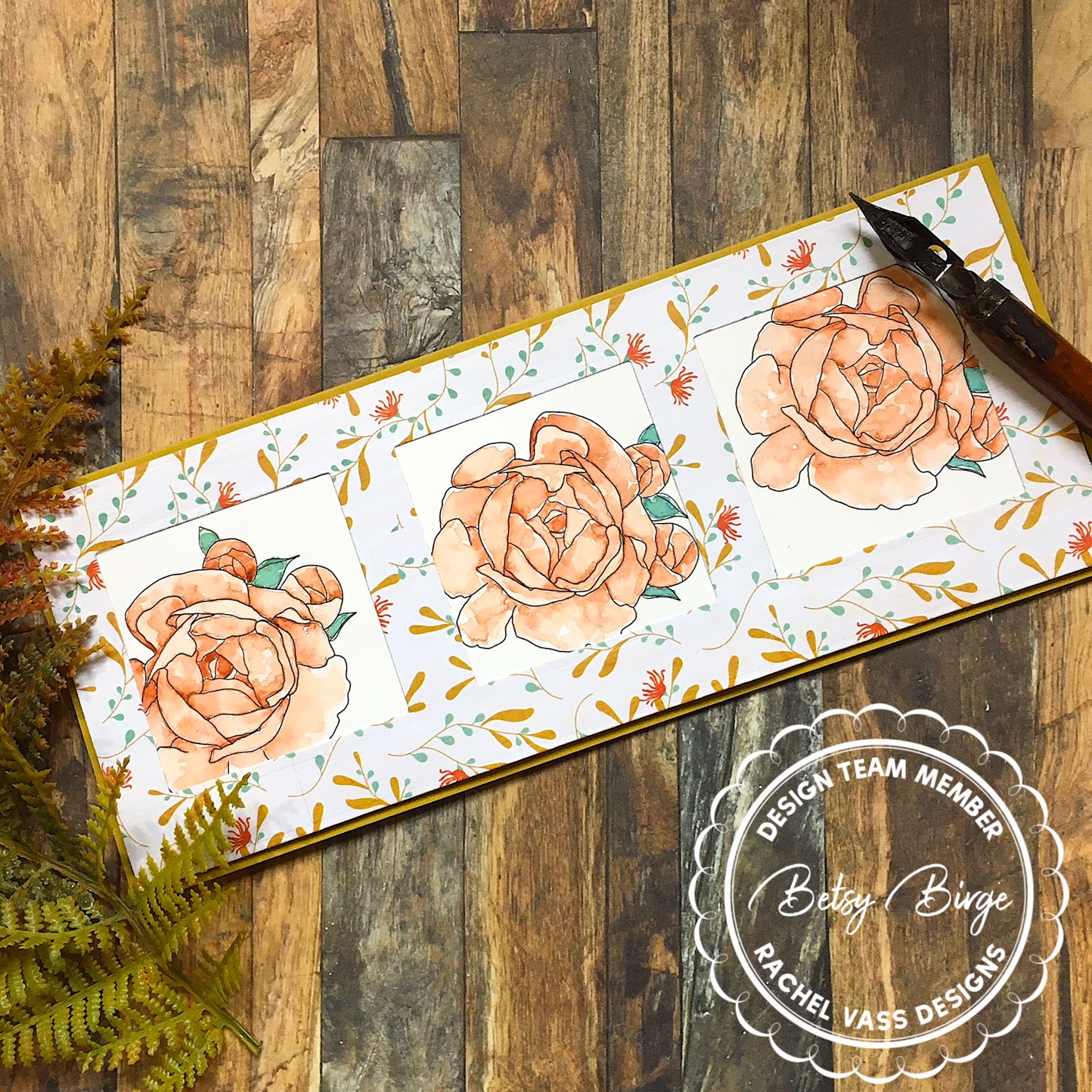
Hello everyone! Today I'm bringing you another beautiful design from
the November Release from:
This is another beautiful design from Rachel! I wanted to make a slimline
and decided on 3 windows with a rose in each. I was going to add a sentiment
and printed one out, but decided not to use it. So, I first sized my image and
then made 3 copies of it on my page and printed it out.

After printing this out, I moved to my card base. After choosing my background paper,
I cut a basic slimline rectangle using a die. Then I measured this panel to
accomodate 2" square openings.

I cut my 3 squares out of my panel really making sure of the placement of
the die. 

I was really pleased with how this came out...measuring is not my strong point! 😅
I knew I wanted to watercolor these roses, so I had printed this out onto 140lb.
hot press watercolor paper. I gave it some time to "dry" - I don't have a laser
printer, mine is ink jet. To minimize ink smearing I like to give the printed piece
some time to absorb into the paper. This actually works. My printed is an HP - and
I use HP inks...just in case you were wondering.
I decided to use Prima Marketing Watercolor Confections - Decadent Pies palette.
This is kind of an odd mix of colors, but I really like it.

I painted each petal separately. I washed it with water...being careful not to wet
the entire petal and dropped color in. Then while it was still wet I went in with a darker
color and added bits for shadows.This is about as messy as I can get with watercolor.
I have to stay in the lines, but I really like the randomness of where and how the color dries.

I really was trying to match my colors to the patterned paper. And it looked
really nice when done and dried.
I cut each rose out leaving enough paper around it so it would work within the
2" die cut squares.
I adhered them from behind with a liquid adhesive. I foam mounted this panel
onto a slimline size base and my card was finished!

I hope you enjoyed today's tutorial. Please watch on social media all month
long for inspiration from the Design Team! It's wonderful release!
Please follow Rachel on Instagram @rachelvassdesigns and
on the Rachel Vass Designs Fan Page on Facebook!
Thank you so much for stopping by!
Betsy
In my capacity as a design team member for Rachel Vass Designs, I do receive the products I use from them.
All opinions and creative decisions remain my own, and I only work with companies/use products that I love.
Tuesday, November 10, 2020
Stencil of the Month with Brutus Monroe

Hello everyone! Today I'm bringing you the latest
This stencil is gorgeous! I chose to use Simon Hurley Inks on my project.
Let me walk you through how I made my card.
I first took a full size sheet of smooth white card stock. I used a bit of Pixie
Spray on the back of my stencil.

This is with the stencil still on.

This was when I was finished with my ink blending. I used Simon Hurley Inks
in: Minty Fresh, Crown Me, Triple Berry and Remember Me. I felt it
needed a bit of something in the center.

Using the Circle Star Stencil and the Remember Me Ink, I added a bit
of the center of that stencil keeping the edges soft. I used the Pink & Main
Ergonomic Blending Brush for my stenciling.
Next I heat embossed my sentiment with Raven Sparkle Embossing
Powder. My sentiment came from the Love You Floral Stamp Set.

I loved the whole look of this card...the soft stenciling and the subtle sparkle
of the sentiment. I didn't use any other embellishments. I mounted this on
a 6" x 6" purple panel and then mounted it all onto a 6" x 6" white card base!

I hope you like and are inspired by my card today! Always so fun
to use products from Brutus Monroe:
The Stencil of the Month is a subscription product. Once you sign up, you don't
need to worry about ordering it every month. It will ship automatically right to
your door. There are many other subscription products as well!
Thank you so much for stopping by today! I appreciate your
interest and support!
Betsy
In my capacity as a design team member for Brutus Monroe, I do receive the products I use from them.
All opinions and creative decisions remain my own, and I only work with companies/use products that I love.
Monday, November 9, 2020

Thursday, November 5, 2020
Comfort & Joy with Brutus Monroe

Hello everyone! Today I'm sharing with you the stamp set from the newest
Inspiration Box from
Brutus Monroe
Comfort & Joy
This stamp set is so cute and retro! This took me back to the '60's!!! The
tv is so spot on it just cracks me up! Let me show you how I created this
slimline card.
I knew I would be stamping out almost all of the images in the set. I took
this as an opportunity to use up scraps of my Neenah 80lb Classic Crest Solar
White card stock. I stamped everything on it's own scrap of paper with
Raven Detail Ink.

Originally I was going to use the "Home" stamp but ended up not needing it. I wanted
to make a cohesive scene so I picked out my papers first. I was really going to a retro
living room vibe. So I chose a small patterned paper for the wallpaper and a wood look
paper for the floor. This allowed me to then color match my Copic markers.

I started with the biggest item first.

I did the drapes next.

The windows were quite plain but I added pale blue for the frosty panes of glass!

Copic colors used:
Window: B60, B00, B0000 Molding/Sils: W0, W1
Curtains: YR61, YR02, R14
Curtain Rods: E31, E33, E35
Chair: YG11, G82, G94, G99
Chair Feet: E31, E33, E35, E37
Chair Doily: C0, C1
Cat: Y21, Y28
TV: E31, E33, E35, 1000, C1, C5
Dog: C1
Welcome Sign: E31, E33, E35
Rug: Combination of colors used
Next I prepared my card base. I made a slimline base from Neenah 100lb
Desert Storm card stock. My card when folded measures 3 1/2" x 8 1/2".
I adhered my patterned paper and wood paper together and attached it to my base.
I used a scrap of white card stock for the baseboard.

I fussy cut all of my images out and adhered them flat to the card. I added shimmer
pen to the window frames so they would look all frosty. I added Glossy Accents to the
screen of the tv to look like glass and then added white highlights with a gel pen.
And that finished my project!

I hope you liked today's tutorial. It was fun making it! We would love
to see your creations on the Brutus Monroe Fan Page on Facebook!
Tag us with your makes!!!
Thanks so much for stopping by! I appreciate it!
Betsy
Wednesday, November 4, 2020
Bountiful Blooms with Rachel Vass Designs

Hello everyone! It's New Release Day at
Bountiful Blooms


This is another lovely set from Rachel that has A2 size as well as Slimline versions. She
also includes a letter size version that prints out 4 different layouts at once. This is
what I used for my project.

Using watercolor paper, I printed out the full size version. I cut this into quarters and
chose the panel I wanted to use.

I decided to paint my panel with Distress Inks.

I chose a combination that Kristina Werner used on a video a long time ago! It
has remained one of my favorites. Here I've painted the background.

I used the background color to also add a bit of color to the center panel.
The Distress Ink colors:
Pumice Stone
Victorian Velvet
Seedless Preserves
Dusty Concord

A very light layer of Victorian Velvet went onto the flowers first.

Next a layer of Seedless Preserves went on. Then I deepened the shading with Dusty
Concord.
I trimmed this panel to 4" x 5 1/4" and backed it with a panel of deep violet card stock
that measures 4 1/8" x 5 3/8". Then the entire panel was adhered to an A2 size top
folding card base of putty card stock. And my card was finished.

I love this color combination so much and using Distress Inks to paint with is so
easy! Rachel now has a blog where you can see awesome design ideas and there
is a link to her shop!
Thank you so much for stopping by today!
Betsy
In my capacity as a design team member for Rachel Vass Designs, I do receive the products I use from them. All opinions and creative decisions remain my own, and I only work with companies/use products that I love.
Subscribe to:
Posts (Atom)

-
 Hello everyone! I am so excited to be a part of the February Release Blog Hop and Giveaway at Joy Clair Designs! You can hop along with u...
 -
Hello everyone! Spring is coming and I hope you are ready for our Joy Clair Designs Blog Hop ft. Springlish Fiesta You Are Loved The team ...

