

Hello everyone! Today I have another beautiful digital stamp set from the
It is gorgeous! Let me show you how I made my card! As always I started out by composing the design in the computer. I use Word in my Mac for a program...nothing fancy. I took the one floral image and copy and pasted it at lease 7 times. I wasn't quite sure where I was going with this! I finally decided on where I wanted my elements and sized them accordingly. I ended up only using 4 of the floral image and manipulated them by flipping and turning.
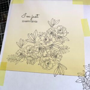
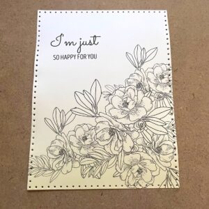
I print the image out onto copy paper and then place my designer paper over it and send it through the printer again. Works beautifully with 6 x 6 papers. I chose a yellow paper (and this one is quite desaturated) because green and red or pink both would look good with an underlay of yellow. This particular paper had an ombre effect. Once that was printed I die cut it with a pierced rectangle die.
I took a piece of the scrap designer paper and tested out some colors. Originally I chose only one green color combination. But I did add another and glazed over both color mixes.
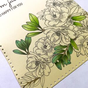
I ended up glazing the smaller leaves with a blue and the larger leaves with one of the reds. I decided to go with red tones, knowing that the yellow underneath would alter the color somewhat.
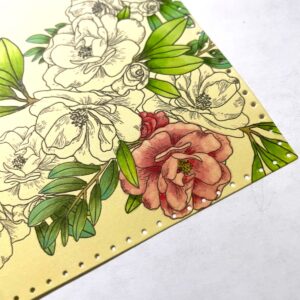
I used the following Copic colors: YG11, YG63, YG67, YG23, YG06. Glaze on the smaller leaves was B02 and on the other leaves was R02. I moved onto the flowers. I used: R81, R83, R85, R35 and my blender for lightening the outer edges. The center were Y02, Y35, Y28. I decided to add a cast shadow so I used W2 for the first and wider shadow and W3 to darken right up against the flowers.
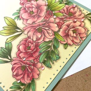
I mounted the panel flat to an A2 size card base made from some very cool green card stock. This really picked up the blue in the leaves. I added some coral sequins and my card was done!
This was such a lovely set to work with! See this set and the other sets released in the
Summerlicious Release at Joy Clair Designs!
Thank you so much for stopping by!
Betsy
In my capacity as a design team member for Joy Clair Designs, I do receive the products I use from them.
All opinions and creative decisions remain my own, and I only work with companies/use products that I love.

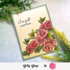
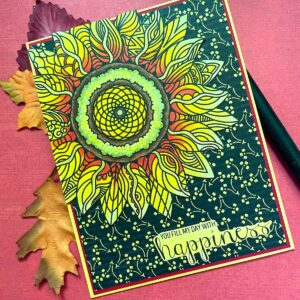
Hello everyone! Today I'm sharing another card made with one of the sets from the
Summerlicious Release from
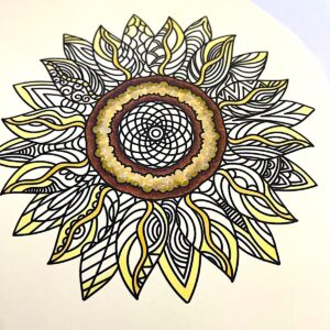
To me, this is a perfect summer card! Let me show you how I made it! As I normally do, I first sized my floral image in the computer and the sentiment. I didn't want to to print this out attached to each other so I set the sentiment off enough to either fussy cut or die cut. I printed the image out onto Neenah Ivory card stock.
I trimmed away the sentiment part and set it aside while I did my coloring. Of course, this image looks like a sunflower and it being summer, I chose to Copic color my image in yellows and a bit of red.
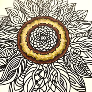
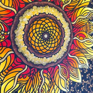
I colored the centers first using browns and yellow/golds. I did this first so I would have something to gauge the rest of the coloring.
I started with my palest yellow first and then slowly worked toward the center of the flower.

I kept coloring around and around the design. The back petals I mostly colored as one unit, the front ones I varied the colors more. I kept the veins in the front petals just a light pale color.
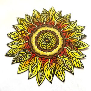
When everything was colored, I fussy cut the image and used a black marker around the cut edges and the bits in-between the petals. Copic colors used: E57, E59, E79, E08, Y21,Y28, YG91, YG95, Y11, Y15, Y17, Y38, R05 and 100. I made a base from yellow card stock, added a layer of red and on top of that added my black patterned paper...all 1/8" smaller than each other. I fussy cut my sentiment and went over it with one of my yellow Copic. I positioned my flower in the upper left corner, adhered it flat to the card and trimmed off the excess. For embellishment I used a gold glitter gel pen. I put it in the center of the flower, I dotted the yellow ring in the flower center and I went up part way on the veins in the petals.
And that finished my card!
The Summerlicious Release is so gorgeous! So many great sets to choose from! And it's available as a bundle! Great way to save! Check it out at
Thanks for being here today! I appreciate your interest!
Betsy
In my capacity as a design team member for Joy Clair Designs, I do receive the products I use from them.
All opinions and creative decisions remain my own, and I only work with companies/use products that I love.


In my capacity as a design team member for Brutus Monroe, I do receive the products I use from them.
All opinions and creative decisions remain my own, and I only work with companies/use products that I love.

Hello everyone! Today I'm sharing another gorgeous card from
Joy Clair Designs
First of All
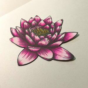
with another gorgeous digital stamp from the Summerlicious Release ! This has the loveliest Lotus flower image! Let me show you how I created my card today! I started by first choosing my background paper which was rather putty gray flower pattern. Then I chose a coordinating plain card stock close to that gray. It was on this plain card stock that I printed off my lotus flower and sentiment.
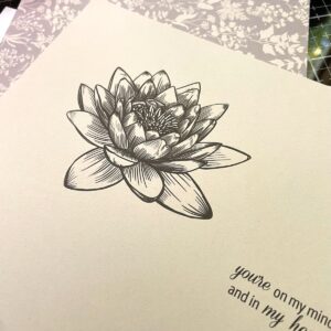
I Google-imaged a lotus flower to get my colors right. I decided to go with the very deep pink one at the base that tips in white.
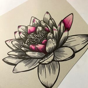
I colored a few petals to make sure I was on the right track with my colors.
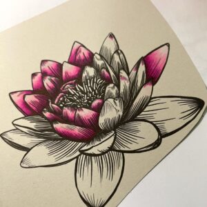
I was pleased how this was looks. The tips needed to be whiter so I used a white colored pencil. This really helped. For Copic colors I used: RV00, RV02, RV04, RV06, RV17, RV69, Y02, Y17 & Y38. After I finished the coloring, I fussy cut the image right up to the line and then went along the edge with a black water-base marker.
I prepared an A2 white card base. I covered it with the patterned paper. I took a panel of the gray card stock and and embossed it with a 3D embossing folder. Using a die set, I cut a larger panel with the biggest die and the sentiment with the smallest die in that set.
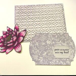
I adhered the embossed panel with liquid adhesive to the base. Then I added the bigger die cut with foam panel. I adhered the lotus flower and the sentiment flat on top of that. I added a clear pink heart to the sentiment, a few tiny dew drops to the flower and shimmer pen to the flower center.
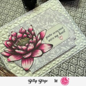
This was not a complicated card and it came out so pretty! I already have someone in mind to send it to! You can find this gorgeous digital stamp set at
First of All digital stamp set
Happy paper crafting!
Betsy
In my capacity as a design team member for Joy Clair Designs, I do receive the products I use from them.
All opinions and creative decisions remain my own, and I only work with companies/use products that I love.


In my capacity as a design team member for Brutus Monroe, I do receive the products I use from them.
All opinions and creative decisions remain my own, and I only work with companies/use products that I love.


