Friday, January 14, 2022

Full Heart with Joy Clair Designs


Hello everyone!  Betsy here with my first blog post for Joy Clair Designs!  I am so excited and feel honored to be a part of this wonderful team!

For my first project I was very inspired by the new Pantone Color of the Year - Veri Peri.  I paired it with the gorgeous Full Heart digistamp.  The 2 together are simply gorgeous!  Let me show you how I made my card!
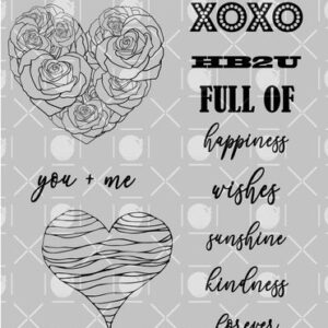
I started by printing my heart image and sentiments onto hot press watercolor paper.
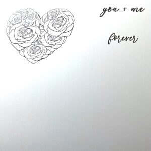
 

I only have an inkjet printer - so nothing special.  I did print my image out the night before and  I think that gives the ink some time to cure.  I used a Watercolor Brush Pen from Altenew called Persian Blue  from their Winter Wonderland Collection.  I chose my background paper - a sheet from Craft Consortium Ink Drops-Vivid.  The pen from Altenew really coordinated well with it.  I squirted some of the ink from the pen onto my glass mat, added water and picked it up with my paintbrush.  I gave the whole heart image a light wash of this color.  I did't leave it to settle into the paper or go over it a lot, just a quick light wash.  You can see it's not an even wash and it didn't need to be.
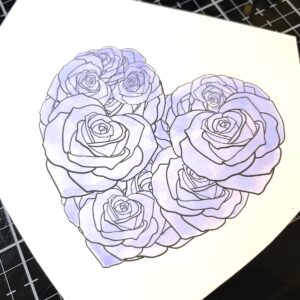
I next started shading it with the same marker only with no extra water.  I only did this on 3 of the roses.
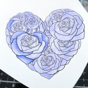
I actually went even darker after these few petals were done as  I really wanted contrast.
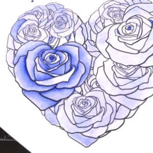
I had plans for the fold-overs on the petals so I didn't shade those particular areas.
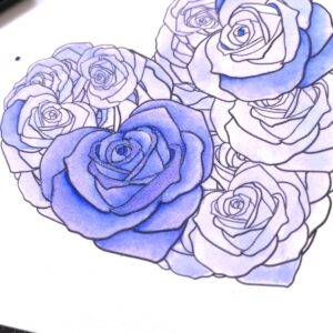
I used Violet watercolor from Zahra Ammar Art on Etsy for the fold over petals.  It gives the heart a little sparkle as it is a metallic paint and that color is so dreamy!
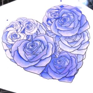
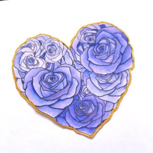
You can also see that my pen splattered when I took the cap off!!!!!  No worries.  I had plans to fussy cut this and even the smudge on the side would be hidden.  I took the violet paint and added a light glaze over the whole heart.  I did this by watering the paint way down and just going over the whole heart lightly.  I next fussy cut the heart and around the white edge I painted gold.  I used Persian Gold from Zahra Zammar Art.  It's gorgeous!
I put a wash of the Persian Blue over the sentiments and then a glaze of the Violet.
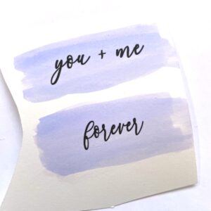
It still needed something so using a fan brush I splattered it with the Persian Gold paint.
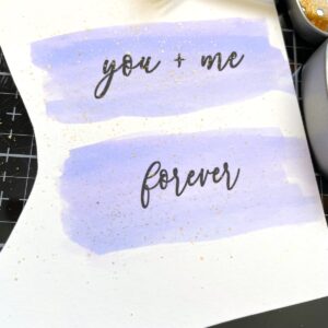
I die cut these sentiments and backed them on gold mirror paper.  I also covered the front of of a standard A2 Size top folding white card with the gold mirror paper and adhered the panel of patterned paper that was cut to 4 1/8" x 5 3/8" on top.
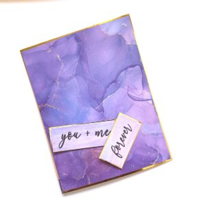
Using foam tape I adhered my heart to the center of my card.  I adhered the sentiments to the top and bottom.  As a last embellishment I adhered small gold foiled pearls around the card.
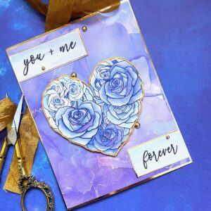
This is such a gorgeous digistamp and can be used so many different ways! I was actually going to go with another layout when I started my project!...I'll save that for another time!  Look for this beautiful digital stamp and many others at

Joy Clair Designs


Thanks so much for stopping by!

Betsy

In my capacity as a design team member for Joy Clair Designs, I do receive the products I use from them.

 All opinions and creative decisions remain my own, and I only work with companies/use products that I love. 

Tuesday, January 11, 2022

Sweet Candy with Brutus Monroe


Hello everyone!  Today it's all about the candy!  Yummy!  I'll be
using products from


What a fun colorful project!  Let me show you how I made my card!
I firs took a piece of Aqua Pigment Watercolor Paper and taped it to
a hardboard.  I was mindful to make sure my tape was straight and 1/8"
covering so it would trim down evenly.  I used the Oval Simple Blend
and taped the oval to the middle of the panel for a mask.


I wanted to be able to splatter my background.  Using a #2 fan brush I
splattered with the Yellow Orange Aqua Pigment first.  I let this dry
thoroughly before splattering with the next color.


I did take care to wipe up some of the splatter that was on the
oval mask.  I moved on to my darkest color which was the blue.


I next used Green with a bit of the Yellow Orange mixed in to make it a bit
more lime colored.  I used Yellow Orange with a bit of Red for an orange
color and I used White Chroma Mist mixed with Red for a pink.  Then to the pink
I mixed a bit of the Blue for a purple.  I dried in-between each color.


I was really pleased with the look of this.  I trimmed this panel down to
3 3/4" x 5".  I next heat embossed with Raven Sparkle Embossing Powder
the candy tree from the stamp set and the edges of a black card stock
panel that I cut to 4 1/8" x 5 3/8".


I adhered both panels to a white standard A2 size top folding card base.
On another piece of the Aqua Pigment Watercolor Paper I stamped out 
the candy elements from the stamp set twice.


Using the same color mixes with the Aqua Pigments I painted my
elements.  I did not paint the little round bubbles.


I fussy cut these elements except for the bubbles.  Next I took these same stamps and stamped
them on my background - mainly for placement but this is how I got my little
bubbles onto the background without having to cut them out.  I also stamped
my sentiment at the same time.  I placed my heart lollipop onto the panel
just so I would make sure I had enough room for it.


I painted the elements on the tree itself using the same mixes
of Aqua Pigments.  I foamed taped the fussy cut elements.  I used
Liquid Pixie Dust on the bubbles.  On the painted elements I used
a shimmer pen.  Then as a final embellishment I used Glossy Accents
on all of the painted elements.  And that finished my card!


What a fun colorful card to make!  And a sweet way to say
"Hello" to a friend!  You can find the product that I used at


Thank you so much for stopping by and taking an interest.
I appreciate your time!

Betsy

In my capacity as a design team member for Brutus Monroe, I do receive the products I use from them. 

All opinions and creative decisions remain my own, and I only work with companies/use products that I love.





Tuesday, January 4, 2022

Love You More with Brutus Monroe


Hello everyone!  Can you believe it's a new year already?  I don't 
know about you but I'm ready for new and better year!  So, to kick
off January 2022 my project will be using products from


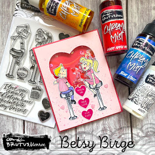
This Love You More Stamp Set is so cute!  I had to make a shaker
with it!  Let me show you how I made my card!
I first stamped my images with Raven Detail ink onto Whitewash card
stock.  I cut a light pink top panel to 4" x 5 1/4" and die cut a heart
shaker window.  This darker pink card stock in the photo will be my
card base.


I started my coloring with Chroma Mists.  I used Blue Violet, Bumblebee
Yellow, Candy Apple Red and White.I mixed the Red and White for my
pink areas and Yellow and White for their hair.  


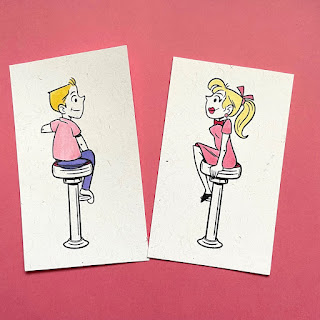
For the skin tones I used Copics E51 and for the stools I used
C0, C3, C7 and 100.  I added a little R20 for their cheeks.


With a glitter gel pen I added stripes to the boy's shirt and polka dots
to the girl's dress.  I also added a bit of white gel pen around the
pupils of their eyes.  Once these were dry I fussy cut them. I also took
a smaller piece of the dark pink card stock to go behind the shaker
bits and sprayed it with an iridescent spray and then adhered it
into place.


 Now it was time for the base of the card.  Placing the evacuated heart back into
it's space to protect the piece of acetate I had adhered there, I splattered Chroma 
Mists that I had mixed - the Red and White - to make a matching pink.


Once that was dry I took out the evacuated piece and flipped over the
main panel to add foam tape.  I used 2 layers of the Brutus Monroe Foam
Tape.  I was going to use some rather chunky shaker bits and I wanted
them to shake freely.  I put a pile of shaker bits onto the base and then
gently placed my top over it.


For a sentiment I used 3 of the candy heart stamps in the set.  For
ink I used Simon Hurley's Prom Queen.  I stamped them on the light
pink card stock and then fussy cut them.


To finish I adhered my couple onto the card using liquid glue and
leaving enough room in-between so one of the candy hearts would
fit into the space, then I adhered the candy hearts vertically.  Finally I
adhered 3 puffy hearts (same ones used as shaker bits) around the
bottom of the card.


I hope you enjoyed the project today.  I had so much fun designing
and making this card!  You can find the products I used at


Thank you so much for stopping by today!

Betsy

In my capacity as a design team member for Brutus Monroe, I do receive the products I use from them.

 All opinions and creative decisions remain my own, and I only work with companies/use products that I love.


Tuesday, December 28, 2021

Flower Doodle with Brutus Monroe


Hello everyone!  It's almost a new year so I am ending my card making
year with something colorful!  I'll be using products from


Even though this stamp set is a 6" x 6",  I used it on my mini slimline!
Let me show you how I made my card!
I first stamped out my image and my sentiment and heat embossed them
I trimmed out my panel right up to the lines so overall it
measures 2 1/2" x 5 3/8".


I used the Chroma Mists to paint in my flowers.  I used 9 colors and had
fun mixing colors that I needed but didn't have.  For all of the leaves I
used Noble Fir, Bumblebee Yellow and Ornament gold to give a bit of
shimmer.


For the blue I used Blue Violet and a bit of white.


For the peachy orange I used Candy Apple Red, Yellow Orange 
and White.  To each of these mixes I also added a bit of Pearl for shimmer.


Later I would add some of my yellow mix over top of the center of
the flower in the upper right corner.  Next was my pink - Candy Apple
Red, White and Pearl.


To the pink mix I added some of the Blue Violet to make a
really pretty lavender.


I used a bit of Tinsel Blue and White for a more traditional blue.


And then I finished up my painting with Bumblebee Yellow, White
and Ornament Gold.


Next I prepared my base.  I cut a 6" x 6" square of Whitewash
card stock.  To that I added a panel of Cabbage card stock Just
1/8" smaller.  Then I backed my painted panel which measures
2 1/2" x 5 3/8" with black card stock with just a bit showing.


For my sentiment I had wanted to make a banner and have it
coming from the right side.  It did not look good.  So I fussy
cut the banner and it still didn't look good.  Finally I cut the 
words apart and that worked!  For some added sparkle I
used some Silver Prism Sequins.  And that finished my card!


I hope you enjoyed today's tutorial.  I love the colors and the
sparkle!  You can find the products I used for my card at


Thank you so much for stopping by today.  I can't believe
we are at the end of 2021.  Hopefully 2022 will see brighter
days head!

Betsy

In my capacity as a design team member for Brutus Monroe, I do receive the products I use from them. 

All opinions and creative decisions remain my own, and I only work with companies/use products that I love.


Tuesday, December 21, 2021

You Bake Me Happy with Brutus Monroe


Hello everyone!  Today I'm bringing you a sweet project using
products from


This was such a fun project to put together.  There's so many ways
you can use small stamps.  Let me show you how I made my card!
I started by taking a heart die and lightly tracing around it, in pencil, on a
piece of watercolor paper.


Then, using dark brown ink, I stamped my elements.  I did use my
MISTI to do this in case I needed to stamp my image more than
once - which I did.  


Once my ink was dry I erased my pencil lines.  I wanted my elements
to have a 1950's vibe to them, so using Chroma Mists I painted them
in aqua and coral.  For the aqua I used  Cobalt Blue and Bumblebee
Yellow Chroma Mists.  I actually mixed a puddle of green and added
it to a puddle of blue.  For the coral, I used Candy Apple Red, White,
and Bumblebee Yellow.  I made a pink with the red and white and
an orange with the yellow and red and then mixed the 2 together.


I did very simple painting with no shading.  For the brown on the
cookies I mixed red, yellow and blue with more yellow than the
other 2 colors.  Next I took a scrap of watercolor paper and with a
1/2" flat paintbrush, painted a strip of aqua and one of coral.


I trimmed my painted panel to 3 1/2" x 5 1/2" and adhered it to the
middle of my A2 size top folding white card base.  I trimmed the
2 strips of color and added them to the sides of the card.  I also
added thin brown peel-offs between the panel and the painted strips.
I stamped my sentiment onto a scrap of the watercolor paper and die
cut it with a small round die.  I die cut a slightly bigger circle out of
aqua paper to put behind the sentiment circle.  I adhered this to my
card.  For embellishments I used small 2-tone flatback pearls around
my elements and added a tiny pink translucent heart to the sentiment
circle.  I adhered the sentiment circle to the lower right of my card.
and that finished my project!


I hope you enjoyed today's tutorial and it gives you some ideas on
how to use those little stamps!  All of the products mentioned
are available at


Thank you so much for taking the time to stop by!

Betsy

In my capacity as a design team member for Brutus Monroe, I do receive the products I use from them. 

All opinions and creative decisions remain my own, and I only work with companies/use products that I love.


Tuesday, December 14, 2021

Family Traditions with Brutus Monroe


Hello everyone!  Winter is starting to appear and it's time to cook
up those recipes that make us warm!  Today I'm using products from


This was such a fun card to make and the recipient will really appreciate
the sharing of a recipe.  Let me show you how I made my card.
I started by stamping my recipe card onto white card stock.  Then I 
stamped my onion and potatoes on watercolor paper.


I only used 4 of the potatoes, but I used the 5th mis-stamped one as
a test for color.  For my Aqua Pigments I used: Red, Yellow Orange,
Green and a tiny bit of Tinsel Blue.  For the onion I mixed Red, Green,
and Yellow with more yellow and less green. This gave me the
Yellow-brown color for the onion.  For the potatoes I used red, a
tiny bit of the blue and a very tiny bit of yellow.


Once my elements were painted, I then glazed over the potatoes with
brown...just to take away the pink tone.  Once these elements were dry, I
die cut them along with the recipe card itself.


I chose my background paper from the Fall Forest Paper Collection.  I
stamped "Soups" across the top of the card on the tab.  I then wrote up
my recipe on the card with a black marker.  Then I mixed up another
puddle of brown and blended it around the edges with a blender brush.


I wasn't going for a smooth blend, but I definitely wanted something
along the edge of the card.


I wanted to use one more stamp from the set, but I felt I needed
to adhered my elements into place first.  Then I stamped my
extra sentiment.


I prepared a 5" x 7" card base from cream card stock.  I cut
my patterned paper to 1/16" smaller than the front of the
card.  I adhered my recipe card to the front using
repositionable glue dots.  This will allow the recipient to
remove the recipe card and keep it.


I hope you enjoyed today's tutorial for the card and you try
making this soup.  It's so good!  You might wonder why I use
red potatoes.  Red potatoes are creamier when cooked and
really make this soup so yummy!  It's been a staple for winter
fare in my house for many years!
You can find the Family Traditions Stamp and Die Set along
with the Aqua Pigments at


Thank you so much for stopping by today!

Betsy

In my capacity as a design team member for Brutus Monroe, I do receive the products I use from them.

 All opinions and creative decisions remain my own, and I only work with companies/use products that I love.


Scavenger Hunt ft. Kate Hadfield Designs

  Hello everyone!  Today I'm sharing with you a great idea for kids and adults – a Scavenger hunt!  These are so fun with a group of peo...