
Hello everyone! Today I'm bringing you more inspiration from
the August 2021 New Release from:

What a beautiful and unique set! Let me explain how I made
my card! I decided I wanted to color my image with pastel pencils.
First, a bit about pastel pencils. Just like everything else, there is
a degree of quality in every set of pastel pencils. The less expensive
the set is, the less quality the pastel pencils are. Soft pastel is
the closest thing to pure pigment you can buy. The more binder,
the less pigment. How can you tell? The more binder, the harder
the pastel in the pencil. There are some good names out there that
seem like they would be worth it, but the sacrifice is in the intensity
of the color it lays down. I'll explain more as we go along.
First I composed my design in the computer and printed it out onto
cold press watercolor paper. This paper has texture.

I trimmed the panel to a standard A2 size, but later trimmed it down. I
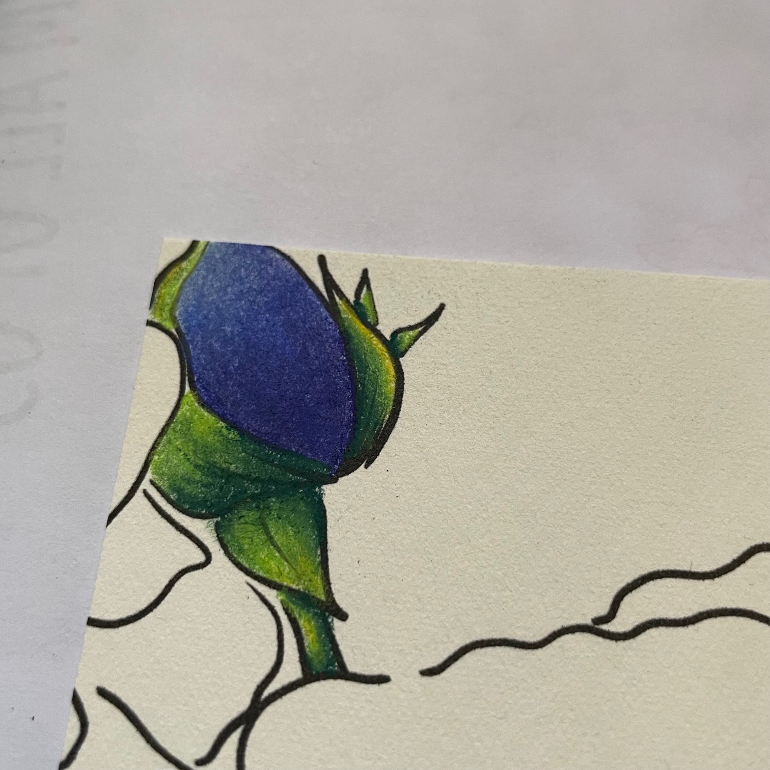
started by coloring the bud. I chose these colors because I had been doing
a pastel painting with them. Stick around to the end of the post and I'll
show you one of my fine art paintings done in soft pastel. 😉 I started with
the bud in the upper right corner. The nice thing about these pastel pencils is
they are erasable.

I applied the lightest blue to the upper third, the medium blue to the
middle and the deep blue at the base. I blended the color with a Color Shaper,
which are silicon tips on a handle. They are quite inexpensive for a
set on Amazon, but you can also use paper stumps - just make sure to use
a different one for each color. I went over this once with the pastels and
blended the colors, then I applied the pastel again and deepened the colors.
I did this for every part of this image.
For the few green bits on the image I used a dark green, a medium bright green
and a yellow for the lightest. Pastels need a rough surface in order to leave
color on the page. That's why the cold press watercolor paper works and
something like white card stock will not work. It is possible to get so much color
on the paper that it simply won't except any more. So, I found 2 layers worked
quite nicely.

Make sure you are aware of where your hands are at all times when
working with pastels. It's very easy to smudge and smear. I moved my
card around a lot. Also be careful when blowing away the dust.
Sometimes spit will fly out of your mouth and you don't even realize it!!! 😧

Next I started working on the flowers. I laid down enough color so there
was visible dust and it covered the paper.

Once all 3 colors were laid down, then I used my Color Shaper to
blend.


This needed another layer of all 3 colors. In my teaching of soft
pastels, I have noticed that people don't lay down enough color to
actually be able to blend. If you don't lay down enough, the entire
process becomes very frustrating. If you are new to this, draw
some circles and practice!

I kept going with all of the flowers in these blue shades.
when I got to the centers I used black.

In the above photo I'm showing you my smearing...ugh! No worries!
I erased it away! To get rid of the eraser bits, I used a dry paintbrush.
It was at this point that I used a fixative. This puts a matte coating on
the paper so there isn't any smudging. You can use hair spray for this!
This also allowed me to go back in and blackened some of my lines that I
lost with a Copic Liner. I trimmed this panel down to 3 3/4" x 5", went
around the blue edge with a Blue Violet Copic marker and adhered it to a piece
of black card stock cut 1/4" bigger. I adhered that panel onto
an A2 size top folding white card base covered with Navy card stock. I added a
butterfly sticker just to break up that blue a bit and I added Black Diamond
Stickles to the flower center.

The intensity of color from the pastels is incredible. I didn't use a
sentiment, although there are some wonderful ones in this set. I felt
I could use this card for anything without one.
I hope you've enjoyed this tutorial and maybe learned something new!
If you have any questions, just put it in the comments and I'll
get back to you!
You can find this new release and all of the other beautifully designed
digital stamp sets at:
Thanks so much for stopping by today! This painting below was the
first soft pastel I painted (as an adult!)

I blended this with my hands and arms! I also used soft pastel
sticks (not pencils). Enjoy!
Until next time!
Betsy
In my capacity as a design team member for Rachel Vass Designs, I do receive the products I use from them.
All opinions and creative decisions remain my own, and I only work with companies/use products that I love.


No comments:
Post a Comment