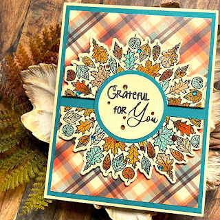
Hello everyone! I am loving all the fall inspiration - it's everywhere!
Today I'm sharing a fall card using products from:
I had sort of an idea when I started making this card, but things seemed
to want to go another way! Let me show you how I did it!
First I had chosen the piece of plaid paper from the Pumpkin Spice Paper
Collection. It was so gorgeous! I wanted the ink embossing to be dark
brown, not black. I stamped the image onto a very desaturated yellow
card stock with a dark brown pigment ink and then heat embossed it with
a clear embossing powder.
Next I decided to use my Zig Clean Color Real Brush Markers to
colorize my images. So I went through my markers, testing colors
to see which ones went best.
I was really please with how well these colors worked with the
plaid paper. I die cut the pieces before coloring. One, because what
if I mess up the die cut after I've done all the coloring 😱 and 2
I would get a better idea of the overall look of the colored panel
on the plaid paper as I was coloring.
I liked how this looked with the 2 halves butted up against one
another, but I also liked the look of it split apart.
I colored my images and sometimes I used 2 colors on
a leaf and sometimes not. This card stock that I was coloring on did
not have a coating like most of the white card stocks, plus the
Zig markers really don't blend well on much besides Strathmore
Bristol Smooth card stock. So, I wasn't really fussy about the
coloring. I was more intent on getting the colors down.
Zig markers used: Mid-Brown, Oatmeal, Orange, Lt. Blue, Scarlet Red,
Pale Orange, Brown, Vanilla, Lt. Brown and Bright Yellow.
I decided to pair the plaid and pale yellow paper with
Sea Urchin Card Stock. Although the blue in the
plaid is quite desaturated, the card stock, being much more intense, made
the blue in the plaid more noticeable. Using the sentiment, which I cut out
with one of the Circle Foundation Dies, I used it as a template to draw
a circle and then cut the circle out about 1/8" bigger.
I gathered all of my elements together. My card base - which is
a top folding A2 size base in the pale yellow, then the Sea Urchin
card stock cut 1/8" smaller and then the plaid piece which is
1/8" smaller than that.
I decided I would split the halves and use a strip of the Sea Urchin
in between.
I also decided to pop up the leaf halves on foam tape.
I really like how this looked. I added the sentiment flat on top of
the 2 halves. Then I added various sizes of gem stones in autumn
colors plus some blue ones. And that finished my card!
I love it when ideas come together. This really looks better than
I had originally planned! You can find these wonderful autumn
products at:
Thank you so much for stopping by and letting me inspire you!
Betsy
In my capacity as a design team member for Brutus Monroe, I do receive the products I use from them.
All opinions and creative decisions remain my own, and I only work with companies/use products that I love.


No comments:
Post a Comment