Friday, September 29, 2023

Autumn Afternoon w/Kate Hadfield Designs


Hello everyone!  Autumn is truly upon us and I am so ready to create fall
cards!  Today I'll be showing you a shaker card made with


This set is full of fall images to create scenes with.  I didn't have a shaker
card in mind when I started, but it just was screaming to be shaken!  ðŸ˜‚
Let me show you how I made my card.


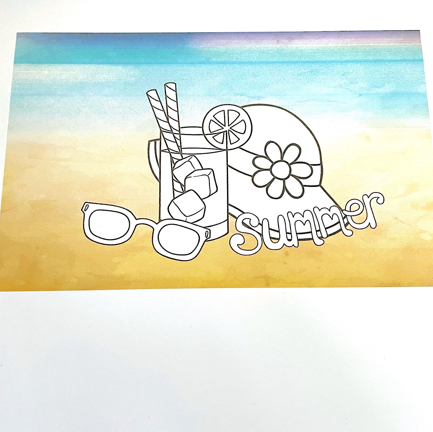
I started out by composing my images in the computer and printing them out onto
white card stock.  I also printed out a sentiment.  At this point I chose my background
paper so I would have a color palette to work with.  This paper is from Scrapbook.com.


Using a scrap piece of card stock I tested my colors and held them up against the
background paper to make sure they worked well together.


As I colored my image I continually held it up against the background paper just
to see how it was going to look.


Copic colors used:
BG0000, BG70, BG72, BG75, R02, R05, R17, R35,
W1, W3, W5, Y15, Y17, YG91, YG95,
YR14, YR15, YR16, YR18,
E08, E15, E18, E19, E23, E30, E33,
E34, E35, E37, E47


Next I made an A2 size top folding card base from Lunch Bag card stock from
Brutus Monroe.  I die cut a circle in the middle of my background panel that was
big enough to encompass the design.  I adhered a piece of acetate behind the circle,
then added foam tape around the circle and the rest of the panel.  I had lightly
drawn a circle on my colored image so I would know where to adhere it to the
card base.  I added leaf shape sequins (from Amazon) to the middle of the
colored image and then placed the die cut background over it.  


Using a banner die, I die cut the sentiment and used one of the lighter 
Copic colors so it wouldn't be stark white.  I adhered this flat to the front of 
the card and I was finished!


You can purchase these digital stamps and more at


Thanks so much for stopping by!

Betsy

In my capacity as a design team member for Kate Hadfield Designs, I do receive the products I use from them. 

All opinions and creative decisions remain my own, and I only work with companies/use products that I love.


Monday, July 31, 2023

100 In The Shade w/Kate Hadfield Designs


Hello everyone!  Hope you are all well and enjoying summer activities.  Hard to believe it
will be over in a month!  ðŸ˜ž. But in the meantime, I've been playing with some beach-
themed cards  ðŸ˜€ using


This is a cute digital set with all kinds of elements - 25 in total!  That's a whole lot of fun to
makes scenes with!  I made a small grouping of elements for today's card.  Let me show you
how I did it!
I wanted to use digital paper for my project so I was able to find a pretty one in my stash. But, it
had been so hot and humid here where I live that my printer was not printing well at all.  Not
all of the ink was laying down, etc.


I decided to go with it, thinking I could fix the top with markers.  So, the first thing
I did was take my markers to the blue on top.


I was fairly pleased with how this came out, but decided that I could ink blend out
the remaining lines that I could see.


I started coloring the image with Copic Markers and decided to do the ink blending
at this point.  I used a darker blue for the top and decided to shade the sand along
the bottom of the panel as well.  Then I moved on to more coloring.


I had stopped coloring on the panel for the day and decided to add Star Dust
Stickles to the wedges in the lemon and the center of the flower.  That way it
could dry overnight.  I continued with the coloring.


I used the Stickles again on the frames of the sunglasses and then added Glossy Accents on the
glass part of them after the coloring was done.  Again I set it aside until it was dry.


I colored the word "summer" with 2 different shades of marker - a pink and a
yellow, knowing they would make orange in the middle...nice summer colors!
I also used 3 shades of brown marker to makes tiny dots to represent sand.
Then I used a gold metallic marker as well.  I cut my panel down to
4" x 5 1/2" and backed it with a panel of copper glitter paper that was
4 1/8" x 5 3/8" and then mounted it onto a White A2 size side folding
notecard.  As a final bit of sparkle I added shimmer pen to the waves in the
blue part of the water along with white gel pen.  I used the shimmer pen on the
petals of the flower and the word.  I also added 3 small shell sequins!


This card was lots of fun to make!  Hanging onto summer for as long as
I can!  ðŸ˜Š. Find this stamp set as well as many other at


Thanks so much for stopping by!  Questions about digital stamping?
Ask me - I'd be glad to help!

Betsy

In my capacity as a design team member for Kate Hadfield Designs, I do receive the products I use from them.

 All opinions and creative decisions remain my own, and I only work with companies/use products that I love.


Thursday, May 25, 2023

Treasured w/Kate Hadfield Designs


Hello everyone!  It's been a hot minute since I did a post!  The project I
have for you today features products from

Treasured

This is a digital set and I'm not sure if you know - Kate Hadfield Designs also
sells colored versions of her digital stamps and colored clip art!  I am not one to use 
digital artlike this, but the colors of these were just singing to me!  This card was so
simple to make - great if you need a card in a hurry!  Let me show you how
I made my card today!
I first placed my papers side by side in the computer.  I cropped them so
they would be narrower and fit on an A2 size card.  Next I placed my elements
on top of the paper.  I did this by "bringing forward" those elements.  I
have a MACbookPro.  It's not new.  I use Word for a program.  The files that
you purchase are PNG files so you can layer them one on top of another.


I printed this image onto white card stock.  It was a bit bigger than an A2 size
card but I wanted to be able to trim it down.  I took a white A2 size top folding
card base and covered it with a gold pearl card stock.  The color was such a
good match!  Then I trimmed down the panel from the computer to
4" x 5 1/4" and adhered to the card.


Using 2 sentiment stamps that I had in my stash, I stamped a
"you" in the middle of the heart and then "are" above "treasured".  This 
all fit amazingly well!


It needed a bit of embellishing, but I didn't go for shine.  I used 5 enamel
dots from my stash that matched in color and that completed my card!


I hope I've inspired you to create something perhaps for the first time!  This
was so easy with the Treasured set from


And the best part?  This set is free and can be yours when you sign up for Kate Hadfield's
newsletter - called The Doodle Den!  On the home page of the website, the sign up is
at the bottom of the page!

Thanks so much for stopping by!

Betsy

In my capacity as a design team member for Kate Hadfield Designs, I do receive the products I use from them. 

All opinions and creative decisions remain my own, and I only work with companies/use products that I love.


Tuesday, April 11, 2023

Springity Spring with Kate Hadfield Designs


Hello everyone!  Happy Spring...finally!  And to herald in warmer temps and
the flowers that are starting to come up, today we are creating a fun spring
card using a digital stamp set from


This digital stamp set has so many little spring elements.  I only used 6 of them
on my project today, but there are many more!  Let me show you how I made
my card.  I started off by composing my elements in my computer and then
printing them off.  I size them, flip them, set them behind or in front of each
other.  This makes for easy composition.


I wanted to color my panel with my Copic markers.  I do not have a
laser jet printer.  Mine is an inkjet.  I keep that in mind when I am
putting color to an image.  I'm not overly scrubbing color on where
there is printer ink.  If I go over it, it's very gently and that way I
don't encounter any smearing problems.


I knew that I needed to lengthen the image so I added quite a bit of
foreground with my green markers.  The Copic colors I used:
Y00, Y02, Y15, Y17, C2, C3, C5, YG11, YG03, YG25, B000, 
BV000, YR21, R81, R83, R85, RV10


After the coloring was done, I die cut a inner scalloped frame out of
white card stock and colored it with my lightest blue Copic so it would match.  I 
shopped my stash for background paper and found this cute plaid that matched
the colors I had used.  I covered an A2 size card base with this
plaid paper.  Before adhering my colored panel to the scalloped frame,
I stamped a sentiment from my stash using a grey ink.  I adhered the 
colored framed panel to the front of my card.  For embellishment, I
wanted to keep things soft, but I had an annoying black spot where I
had layered the grass close together.  I had some tiny light green  iridescent
stars so I adhered a smattering of those through the grass and that 
covered that little spot.  I also used a shimmer pen on the sun, flower
centers and bee wings.  And that finished my card!


I hope you enjoyed today's tutorial.  If you ever have questions about
working with digital stamps ask us!  You can leave questions here or
on our social media.  We would be happy to help you!  You can find
this set of digital stamps and many others at


thanks so much for stopping by today!

Betsy

In my capacity as a design team member for Kate Hadfield Designs, I do receive the products I use from them. 

All opinions and creative decisions remain my own, and I only work with companies/use products that I love.